Denver Cat Company is a non-profit cat rescue. This was my first project having first hand experience with a client. This case study will tell the story of our mistakes and the learning experience we gained. Two designs were created; one before meeting with the client & one after meeting with the client. -Team of 4 with a deadline of 2 weeks-

_______________________________________________________________________________________________________________________________
The Double Diamond Process promotes creativity and innovation, while making it clear when decisions should be made and when teams should commit to a direction. A successful Double Diamond Process ensures that product requirements and design work are focused on user needs. The Double Diamond diagram illustrates two modes of thinking that occur during the strategy and execution stages of the design process. Teams can use divergent thinking to explore many possible solutions and generate novel ideas. The second stage is dedicated to convergent thinking, which helps to analyze, filter, and focus ideas, bringing clarity and direction to the design process.

Through conducting user interviews, creating affinity diagrams, empathy maps, and user testing we discovered that users have problems with not getting enough information about the cat they want to adopt and problems with the site not being updated with currently available cats.
_______________________________________________________________________________________________________________________________
We began our user research by first creating a Proto-Persona of our predicted user. We then create an interview plan to gain insight on users' problems and needs. Interviews are conducted then, those transcripts and the information gained are used to create Affinity Diagrams and Empathy Maps. With that information we are able to understand our user and create a more defined User Persona. After defining our problem statement and our solution we created a journey map and storyboard corresponding with our user persona. We then began the ideation process where we; created lofi wireframes/prototypes, performed brain writing exercises, feature prioritization matrix, competitor analysis, and user flows. User testing was performed after the ideation process and continued thoughout the rest of the design process. Using the User Flow chart we established a User Task Plan to conduct more testing. We then applied what we learned from the user testing to iterate our design and conduct more user testing, including A/B Testing.
We began our process with creating a user Proto-Persona as a basis our user. The proto persona is a made up user that we create based on our assumptions of the type of person that would use our site or app. In the case of Denver Cat Company we at least knew that the typical user at least likes cats and most likely wants to adopt a cat from the site.

Our team constructed an interview plan and interview questions. We then conducted 5 interviews. We asked a variety of questions to a variety of potential users. We wanted to know what are the users' goals, interests, likes, and most importantly pain points. Insights gained from the interview notes were placed into sticky notes and organized to be used in an affinity diagram.
Using our interview notes we created an affinity diagram, which is a way of categorizing the information to gain further insight into our user. We created four category groups; Pain Points, Wants, Web Adoption Experience, and Pet Experience.

The information we gained from interviews and the affinity diagram were helpful but using that research we were able to create an empathy map that will help create our final user persona. Empathy Maps help us better understand how our user thinks, how our user feels, what they do, what they say, what they need/want, and what problems they experience.
All that work was done to funnel in on defining a more accurate user persona. Here we have Paul McCatney, an outgoing 29 year old, who works at a micro brewery. Paul is looking for a cat that has dog like personality traits. He has grown up with dogs, so he is looking for an animal that is more independent to match his busy schedule. Paul has been frustrated with unorganized websites not being able to allow for searching his needs.

This is about what Paul experiences in his journey from wanting a cat and adopting a cat through Denver Cat Company's website. A better understanding through Paul's feelings and thoughts show us where there are opportunities for us to improve. We can get a clearer picture of how to make our users' experience with Denver Cat Company stress free through Paul's journey map.
Here we have a storyboard of Paul's cat adoption experience from beginning to end. Created with StoryboardThat.com
Panel 1: Paul is trying to find the purrfect pet (cat) to adopt. He's been searching online and a local cat adoption's website has outdated information and he can't schedule a visit around his busy schedule.
Panel 2: Paul works in a brewery and daydreams about finding a companion that can be independent while he's away. He's often active and would love an active cat to possibly take along on trips.
Panel 3: On Instagram, he found Denver Cat Company's page and went to their website linked on their page. He found a cat's profile that seemed to be the perfect match, the one he had always wanted.
Panel 4: He booked a visit to the cafe through the website, to meet his new companion. He grabbed a quick drink and chatted with his fellow cat lovers while filling out his adoption paperwork.
Panel 5: Paul and his new pal return home happy to have found each other through Denver Cat Company.
Competitor analysis is a valuable tool for understanding the market landscape and uncovering potential opportunities in a case study. It involves researching the strategies, products, and services of competitors in order to better understand the competitive environment. The SWOT method is then used to analyze the results of the competitor analysis, providing a comprehensive look into the strengths, weaknesses, opportunities, and threats (SWOT) of the organization in question. This can help guide strategic decision making and ensure success.
Brain writing is a creative problem-solving method that encourages group collaboration. It involves a group of people writing down ideas, one idea per person, on a piece of paper. All the ideas are then pooled together and discussed to come up with a solution. This method allows for more ideas and perspectives to be shared, as everyone in the group participates and offers their ideas. The goal is to come up with a creative and innovative solution to a problem. Brain writing can be used in any situation where problem-solving is necessary.
A feature prioritization matrix is a tool to decide which features are most important in a product. You assign a value to the features and rank them according to the value. For example, if the value of a feature is high and the cost (or complexity) is low, then it is more important than a feature with low value and high cost (or complexity). This matrix can help decide which features to include in the new site or which features to focus on in the existing site. As you can see, we used our results from our brain writing exercise.

User flows determine the path a user will take to reach thier goal. User flows provide a step by step breakdown through the site to accomplish tasks. This user flow is for a user going to the site with the goal of booking an apppointment to meet a cat to adopt.
Four user tasks were decided on for the user test plan and were given to five testers. In order to ensure that the testers could complete the tasks without any interference, the goal was given to the tester, and the necessary steps to complete the task were made available to the one conducting the tests. The four goals were: Browse the website, Find more information about the cats, Find out who the founder of Denver Cat Company is, and Book an appointment. With a 100% success rate, the user test plan was successful in achieving its goals.
The testers found the user experience to be straightforward and easy to use, with all of the paths necessary to complete the tasks being clearly laid out. The UI also earned high praise from testers, which appreciated the fun animations and pleasant aesthetics. The results of this user test plan highlight the effectiveness of having clearly laid out goals and paths for users to follow.

This website redesign was a school project so we had to work within the given time frame. Unfortunately, our client meeting was later than expected. Therefore, we had to continue with class and continue our research and design process.
Our redesign of the company website was inspired by the iconic architecture of the Denver Cat Company building itself. This architecture reflects the welcoming and down-to-earth atmosphere of the company, which makes customers feel as if they are at home. This design gives our website a more personal feel that customers can remember for years to come.

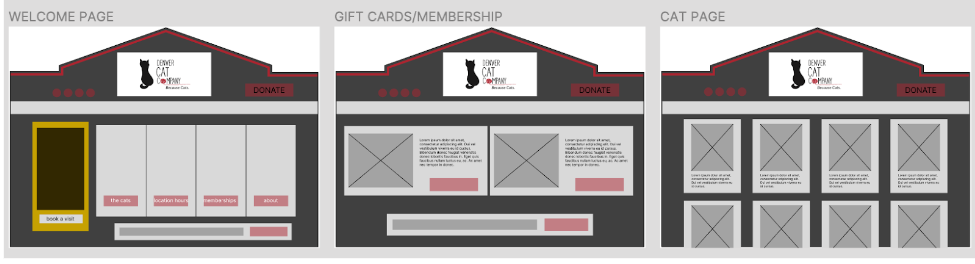
We began our low fidelity wireframes with the building as the base of every page. We created the Homepage, Gift Cards & Memberships page, and The Cats page. Later, after a thorough review of the existing website, we discovered an Arts & Cats (Crafts) page that would need to be added to our designs. There were two main call-to-actions: a 'Donate' button and a 'Book A Visit' button. We decided to prioritize the 'Donate' button at the top of the hierarchy. The 'Book A Visit' button was placed on the door, along with store information such as location, hours of operations, and phone number. The original site also had a newsletter with a statement about how they "might not answer back," so it was placed at the bottom. In later iterations, the newsletter sign up was moved to the Gift Cards & Memberships page.
Our color palette and gradient is based on the building's color scheme. The logo features a yellow frame around a cat, with the subtext "Art.Cats.Cafe." beneath the company name. We added a frame that appears behind the button when hovered, to emphasize the crafts shop. Our header text is in Oxygen Mono font, button text is in Antonio font, and body text is in Public Sans font. We would later find out that the building was remodeled during this redesign, but the color scheme stayed the same.
The homepage wireframes went through several changes before the client meeting. We put the newsletter at the bottom, as the existing website suggested it was of low priority. We struggled to decide what color to make the sign-up bar, but eventually settled on placing the newsletter sign-up at the bottom of the Membership/Gift Cards page. The donate button was placed above the door, next to the streetlamp, which would light up the button when hovered over. The door has all the company information on it. Upon hovering, it cracks open, revealing a cat peeking outside and a ball of yarn that rolls out to the 'O' in the company name, just like in the logo. The buttons, located in the windows, take the user to the specified page when clicked. When hovered over, a picture frame with the corresponding image appears.
The Denver Cat Company website consists of five main pages. The homepage fits the screen and is non-scrollable. The Cats page has photos of the cats that enlarge when clicked and show additional information about them. The "Book Visit" button takes you to a page with an appointment form. The Shop page has a Membership section, Gift Card section, and Newsletter section, with top navigation to go to each section with one click. The Arts & Cats (crafts) page is the longest, with many options from yoga and pumpkin carving to over 20 different painting sessions, each with their own page when clicked. The About page has information about the company, along with photos of the founder, team, and building interior. We incorporated the yellow frame aesthetic with plans to use the exact frame shown in the company logo in later iterations. The top of the building, donate button (CTA), lamp post, and socials all stay fixed to the top during scrolling.
The mobile versions are similar to the desktop screens, but without the animation interactions. We kept the building look of the homepage by using the building frame, door, and lamp post. The frames that pop up from behind the buttons upon hover in the desktop version became the buttons themselves for the mobile version. The grid layout changes in the mobile version to improve user interactions and accessibility. The lamp post is only on the homepage, rather than all pages, to save space and reduce clutter. The two call to actions, ‘Donate & Book Visit’ buttons, and everything above them, stay fixed to the top during scrolling.
The Denver Cat Company building is iconic and memorable, reflecting the company's down-to-earth "homeliness". We incorporated the building into the design wireframes and added more fun interactions throughout the website prototype, such as the lamp post shining light on the donate button when hovered over. The buttons in the windows take the user to the specified page when clicked. When hovered over, a picture frame with the corresponding image appears. The pages are laid out in a simple, digestible way to ensure a better user experience. In this early prototype, some consistency fixes should be made.
We were grateful that the client, founder of Denver Cat Company, took the time to meet with us despite their busy schedule. We had forty minutes to discuss the project before her next meeting. We presented her with our research and prototype, and she liked it, but it wasn't the direction she wanted to go with the redesign. She explained that the arts and crafts portion of the company had been eliminated. The frame in the logo, the 'Art.Cats.Cafe' logo subtext, and the paintbrush decal in the window were all discarded. She also mentioned that she is in the process of removing the memberships and gift cards. We learned that while she liked the darker background color, she wanted the site to be all on one page, more like a blog setup. We had to rapidly redesign our prototype to meet the client's needs before the deadline.

The style tile changed slightly. The logo no longer featured a yellow picture frame around a black cat, but instead just a yellow cat, and was no longer on a white background. The subtext under the company name was changed from “Arts.Cats.Cafe.” to “Because Cats”. The hover state for the main section buttons no longer has a frame peeking from behind.
The desktop version of the website was quickly redesigned using the first pre-client prototype assets. The site was redesigned as a single, scrollable page, with the exception of the "Book A Visit" page, which was kept separate due to the large number of form fields it contained. The company name was altered to match the font of the company logo. The "Memberships", "Gift Cards", and "Arts & Crafts" sections were removed, as well as the lamp post, picture frames, and building aesthetics. The four buttons in the windows at the top of the page scroll down to the corresponding section when clicked. The yellow cat logo remains fixed to the top left during scrolling and takes the user back to the top of the page when clicked.


We were able to make design iterations after speaking with the client, while also trying to keep the user in focus. We were grateful for the client taking the time to meet with us, though we weren't able to explain the user research we conducted in detail. As a result, the site was redesigned more for the client's wants than the user's needs. If I could go back, I would try to explain more about User Experience Design and why user focus is so important. Additionally, I would like to run user testing on the post-client meeting redesign.

The mobile version of the website was also quickly redesigned using the first pre-client prototype assets. The buttons were placed above the windows, and the desktop version should have been done the same way. The site was redesigned as a single, scrollable page, with the exception of the "Book A Visit" page, which had a large number of form fields and was kept separate. The mobile version was designed with a four-column grid and re-organized to fit the screen. The company name was changed to match the font of the company logo. The "Memberships", "Gift Cards", and "Arts & Crafts" sections, as well as the lamp post, picture frames, and building aesthetics, were removed. The four buttons at the top of the page scroll down to the corresponding section when clicked and remain fixed to the top when scrolling, along with the logo and company name.


After meeting with our stakeholder, Leila, she expressed a desire for a polished, sophisticated, and slick website design. Unfortunately, she informed us that Squarespace was currently the only platform available for creating and updating the site. Leila's hectic schedule prevented her from offering further details, causing our team to struggle to make our design vision understood. We had a limited window to make alterations based on the new info received during the meeting, but we still managed to create a website that could be tested by users. The success of this project in the future revolves around our ability to demonstrate to the stakeholders that the website we designed is tailored to the users' needs and that we understand the importance of providing a smooth user experience. It was a fun and incredible learning experience for the whole team.